Essential parameters for choosing an Sunlight Readable Display Full resolution of brightness, contrast, and color gamut
In Europe’s tech-savvy markets, where efficiency and precision reign, distributors need more than buzzwords—they need actionable insights. For LCD screens, three pillars—brightness, contrast, and color gamut—determine whether a display thrives in boardrooms, studios, or living rooms. Let’s dissect these metrics with surgical clarity.

- Brightness: Beyond the Numbers
Key Question: “Will this screen perform in a Berlin office flooded with natural light or a dimly lit Parisian boutique?”
Baseline: 300 nits (cd/m²) suits indoor use.
Premium Tier: 400–600 nits for HDR compatibility or high-ambient-light environments (e.g., retail displays).
Critical Note: Prioritize uniform brightness distribution (≤10% deviation) to avoid patchy visuals.
Why It Matters for EU Distributors:
Compliance with EU Energy Labeling (e.g., A++ ratings) hinges on balancing brightness with power efficiency.
Highlight adaptive brightness sensors—key for meeting Germany’s Blue Angel certification (reduced blue light emissions).

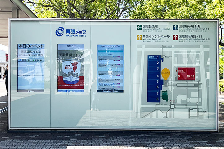
Sunlight Readable Display case
- Contrast: The Silent Differentiator
Key Question: “Does this display handle Nordic noir’s moody gradients or a luxury brand’s black-tone packaging?”
Static Contrast: 1200:1 minimum for professional use (design/editing).
Dynamic Contrast: Useful for marketing materials but irrelevant for critical workflows.
Tech Edge: IPS Black panels (e.g., 2000:1 contrast) are gaining traction for deeper blacks without sacrificing viewing angles.
Why It Matters for EU Distributors:
Contrast directly impacts perceived quality—a make-or-break factor in Southern Europe’s design and fashion sectors.
Pair with matte anti-glare coatings for Mediterranean climates where sunlight is relentless.

- Color Gamut: Accuracy Over Hype
Key Question: “Can this screen replicate Milan’s Pantone-certified branding or a filmmaker’s DCI-P3 workflow?”
sRGB 100%: Non-negotiable for web designers and general use.
Adobe RGB 95%+: Mandatory for print studios in Amsterdam or Zurich.
DCI-P3 98%+: The gold standard for content creators targeting streaming platforms.
Why It Matters for EU Distributors:
Europe’s tightening CE marking rules demand transparency in color claims. Avoid “wide gamut” vagueness—specify exact coverage.
Offer pre-calibrated models (ΔE <2) to appeal to photographers and post-production houses.
The EU Edge: Merging Performance with Responsibility
TL;DR: In Europe, specs must serve a purpose. Brightness adapts, contrast delivers depth, color gamut ensures trust. Equip your clients with displays that solve problems—not just sell pixels.
